
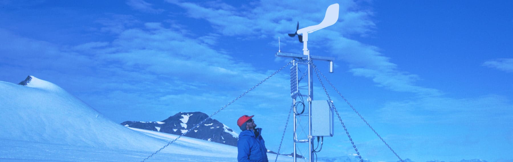
Mapping wind speed and direction in Antarctica
A common problem with scientific data is how to visualise large data sets. In this section we will be looking at how we can visually interpret and understand data better.
Visualising data sets
Here we take a text file of data with longitude, latitude and attached attributes and make it easier to visually interpret and understand by simple GIS visualisation techniques.
The PowerPoint below demonstrates how this can be done using ArcGIS and a complicated data set.

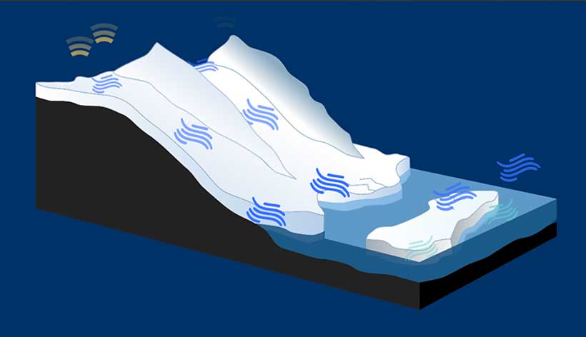
Katabatic winds
“Over Antarctica prominent cold katabatic winds are blowing for most of the year. This video was taken near Hope Bay, it’s a force 8 wind with minus 20 degrees Celsius which results in an apparent temperature felt on the exposed skin (wind chill) of about minus 50 degrees Celsius.”